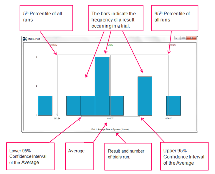
MORE Plot
The MORE Plot is a way of displaying risk and error to further support decision making.
MORE stands for Measure Of Risk And Error
After running a Trial, a MORE Plot is generated for each KPI.
The MORE Plot will display:
- The frequency of all trial run results in a graph
- Annotations of the graph, including:
- Confidence Intervals of a long term average
- 5th and 95th Percentiles of all runs
- Likely and unlikely results
Using the MORE Plot
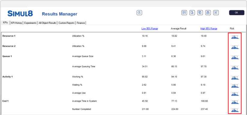
- Once KPIs have been added to your Results Manager, run a Trial from the home tab.
- Once the Trial is complete, access the MORE Plot for each KPI by selecting the graph icon under the Risk column on the KPIs tab of the Results Manager.
Understanding the MORE Plot
Please refer to the example MORE Plot below. Each section of the graph is annotated so that you can understand what the MORE Plot is showing you for your results after you have run a trial.
Benefits of MORE Plot
Simul8 currently provides confidence intervals for the mean as an output when running trials.
Confidence intervals are often misunderstood as a measure of the risk but they are actually a measure of error.
Why is this important?
When using simulation we are trying to make a decision based on what might happen in the future. The average and confidence intervals around our KPI’s might not always give us an indication of how risky our decision is.
A MORE Plot shows this risk, helping you understand the true variability of your results and therefore giving you assurance that the decisions you are making is the correct one.. It also highlights whether or not you have done enough runs of your simulation to really be sure in the answer to your question
Simul8 also provides you with the results of each KPI in each individual trial run.
The MORE Plot allows you to see how these runs look in a graph which makes it much easier to see the variability and therefore risk around your KPI’s.
For more information on MORE plots see Barry L. Nelson’s paper: The MORE Plot: Displaying Measures of Risk & Error From Simulation Output
What is it Telling Us?
If this result is from runs of 1 week then:
- The average is showing the best estimate of the long term average over many weeks.
- The 95% confidence intervals of the average are showing how confident we are in our prediction of that average (so with only 10 runs we can’t be very confident)
- The histogram is showing the outcome of each week, so you might tell your boss you are confident the average will be between 221 and 233 but any given week could be lower than 216 or above 236