Customizable Charts
With Simul8 you can customize the appearance of your charts and the data they display.
Double click on a previously created chart or select the Chart Button on the Design tab, to open the Chart dialog.
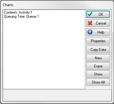
Select a previously created chart or select “New” to open the Chart Properties dialog, this allows you to edit all the properties of the chart.
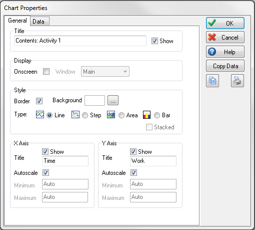
The General tab allows you to choose Chart Style, you can choose from the following options;
- Line
- Step
- Area
- Area Stacked
- Bar (only in Simul8 2016 and later)
- Bar Stacked (only in Simul8 2016 and later)
You can also define other attributes such as axis Label, scaling, chart background color and how the chart is displayed on the simulation window.
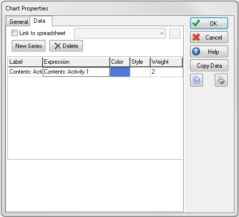
The Data tab is where you can select data series to be included in the chart.
To do this select the New Series button and then double-click the cell in the Expression column. You can then navigate to information you have set up in your simulation using the Formula Editor.
You can also define
- Line Color
- Line Style
- Line Weight
For information on populating charts with Simul8 spreadsheet data, please click here