State Chart Example
The example below uses state charts to represent a person’s journey from feeling ill, to seeking an emergency room, to being assessed as able to be sent home or having to stay for further treatment. In the image below the interaction between the state chart objects and the simulation objects are highlighted. For more information on how to use State Charts in your simulation see State Charts.
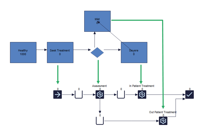
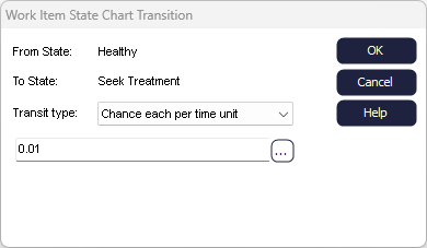
The first state charts represent the population around the emergency room that patients could arrive. This is then set to a likelihood of how often a person has a chance of becoming sick. In this example that is set to a 1% chance per hour.
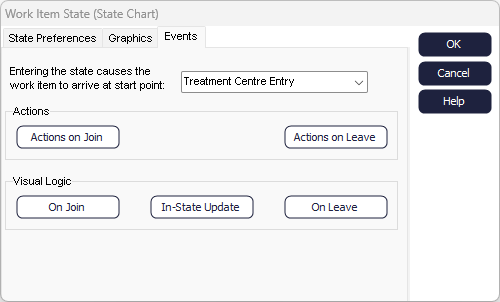
The “seek treatment state” is where they enter the simulation of the emergency room. This is linked to the Start Point of the simulation via the seek treatment state charts within the event tab as seen below. Note that the arrival time is set to every 10000 hours to ensure no other Work Items arrive at the simulation.
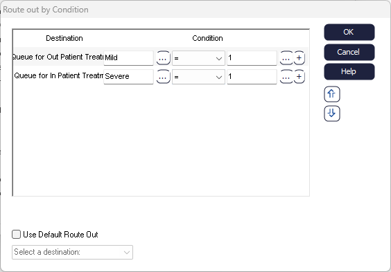
As the patient enters the assessment Activity, they will either be assessed as having mild symptoms and in that case to be treated at the emergency room and sent home, or, if their symptoms are severe, they are sent to be treated further. This is connected by setting the routing out of the Assessment Activity to by condition and setting the condition for each route equal to the Label of mild or severe (which is 1) as seen in the image below.
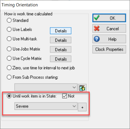
If they have severe symptoms, they are sent to the In-patient treatment centre until they are in a stable state. The timing of the Activity is therefore determined by the state it is in, meaning that until the patient is not released until that patient is no longer in a severe state. This is linked within the Activity’s timing where the severe state chart state is selected and the button for not being in is checked as seen in the image below.
Once the patient enters the mild state of the state chart – which in this example is set to transition at a 10% likelihood per hour - the patient is released from the In-patient Activity and sent out to the End Point.